Top 9 worst kits in rugby history

Leicester Tigers revealed their new kits for the 2020/21 season yesterday to a, it’s safe to say, mixed reaction by rugby fans online
Credit: Leicester Tigers
Its something fans and rugby clubs’ merchandising departments look forward to before every season: the new kit reveal.
Leicester Tigers announced their eye-catching new strips yesterday, with the away number particularly jazzy due to the splash of neon oranges, greens and pinks.
Although it looks like someone has let their kids try tie-dying unsupervised during lockdown, it is made all the more funny to imagine the reactions of Ellis Genge, Tom Youngs and Dan Cole when they first try it on.
Despite the away kit being a Dr Seuss-style nightmare, The Flanker thinks the home kit isn’t too bad as the club try to stick to the old Tigers principles with a modern twist. Many on social media disagree, however.
In order to make Tigers fans feel better (lets face it, they need it after a terrible few seasons) The Flanker has found nine kits worse than theirs for next year.
9.) Scotland - 2012

Credit: Getty Images
We kick off with this really garish outfit Scotland utilised back in 2012. Anyone designing sports shirts remember this one rule - don’t try to incorporate the national flag into it.
This jersey looks as if a plain blue shirt has been attacked by a roller sopping in white paint.
8.) Melbourne Rebels - 2014
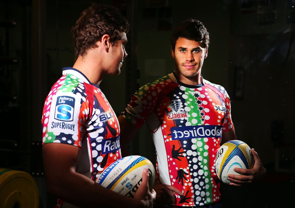
Credit - Getty Images
The sentiment behind this jersey, to acknowledge indigenous Australian people and culture, was a fantastic initiative and keeps it from nearing the top of this list.
However, the execution was a car crash, with it looking like Bing Bong from the Pixar film Inside Out has thrown up all over it.
It honestly looks like they have tried to fit as many colours on it as possible without giving a toss about the appearance or appeal.
7.) Calvisano - 2005/06
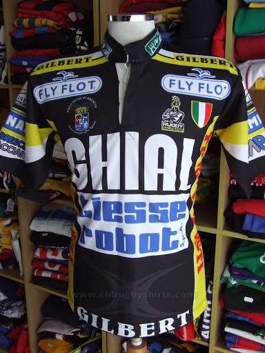
Credit: SHOP VINTAGE & SPORTS
This is a doozy as Calvisano tried to cram in as many sponsors as they possibly could onto their home shirt.
To make matters worse, the old Italian club finished bottom of their Heineken Cup pool that year without a single point to their name.
If their strategy was to distract the opposition with this strip, it didn’t work. A true eye sore, Guy Fieri from Diners, Drive-Ins and Dives could easily pull this one off.
6.) Canada - 1995 Rugby World Cup

Credit: Mike Hewitt/Getty Images/Filie
We love Canada and everything they offer to the game, especially at World Cup time. But this is a step too far from the Canucks.
Their classic red jersey ain’t too bad, even though it manages to look baggy on their legendary back rower Al Charron.
The main point of contention is the terrible flower/maple leaf multi-coloured pattern on the right shoulder that looks like Ronald McDonald has coughed something up. A true assault on the senses all round.
5.) Scotland - 1999 Rugby World Cup

Credit: Getty Images
Irn-Bru may famously originate from Scotland, but it probably isn’t a good idea for the rugby team to design their kit around it.
This fluorescent mess made them look like a hybrid of Dundee United and Johan Cruyff’s Holland, before going on to narrowly lose 18–30 against Lomu’s All Blacks at the quarter-final stage of the tournament.
No shame in that, but great shame can be found in this jersey.
4.) Ospreys - 2010/11

Credit: Classic Rugby Shirts
Thankfully for the Ospreys, Alun Wyn Jones, Ryan Jones, Shane Williams and everyone involved, this is only a training shirt and never saw the light of day in an official game.
Still, imaging having to train in this technicolor abomination. The different shapes and tessellations look like something Picasso forget to draw, with this one giving us at The Flanker a headache to look at.
3.) Stade Francais - 2010/11

Credit: Getty Images
Stade Francais have previous with pushing the boundaries on their kits, so any number of them could have made this list.
However, we have plumped for this truly bizarre offering in 2010. James Haskell looks confused and so are we.
Apparently, this features the face of Parisienne 13th-century heroine Blanche de Castille, the wife of Louis VIII, with the club describing it as “in the fashion of Andy Warhol”.
All we can see is Zac Efron in a pink cowboy hat and 1980’s era Chevy Chase in the midriff area.
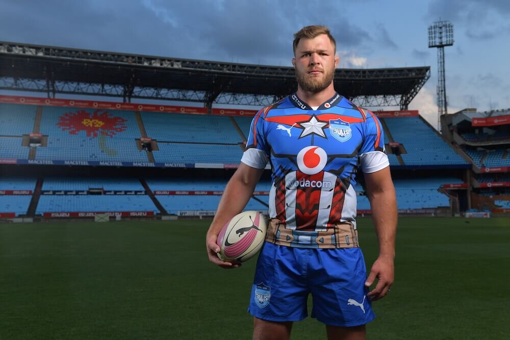
2.) Blue Bulls - 2019

Credit: Blue Bulls
This monstrosity is a result of the collaboration between SARU, DSTV, SuperSport, Marvel and Vodacom where the South African Super Rugby teams all had novelty kits to promote the bloated superhero film franchises.
Marvel clearly needed the promotion for their films, so they decided to (bizarrely) muscle in and kit out the players like superheros.
The Sharks had a Black Panther strip, the Lions took on Spider-man while the Stormers made a pretty unconvincing Thor.
The pick of the bunch was unquestionably the Bulls’ Captain America jersey. Making their players look like overgrown toddlers, a particular highlight is the designers keeping Cap’s belt on the shirt.
Great attention to detail lads.
1.) Nambia - 2011

Credit - Classic Rugby Shirts
All I can say is, I would put good money on sponsor Namibia Milk Board having a big say in the design of this novelty jersey.